
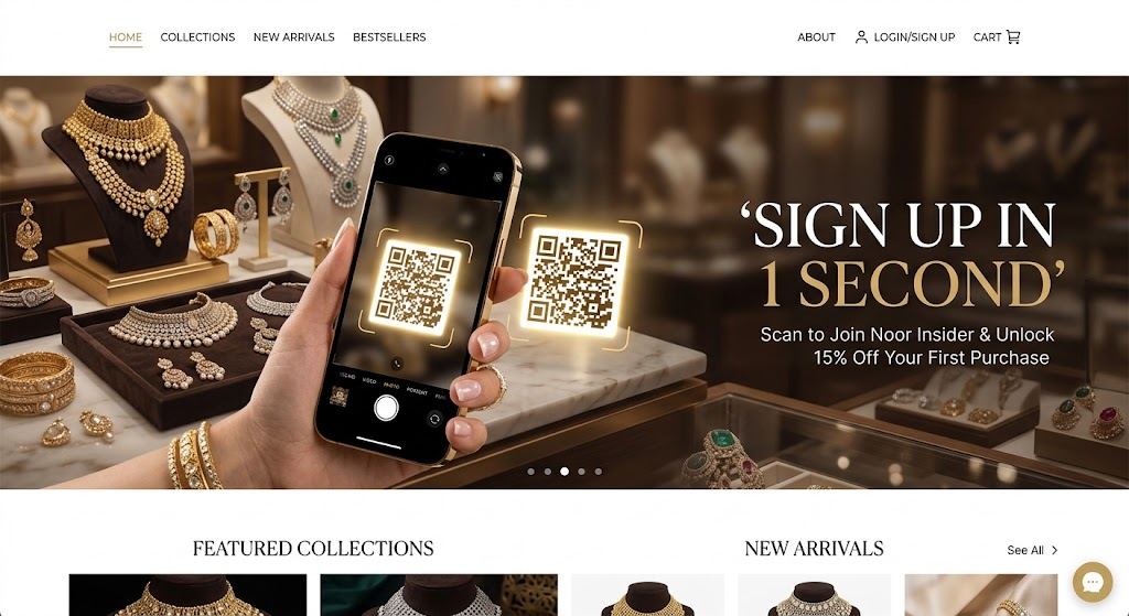
We’re pleased to announce an important website update at Sami Jewellers.
SamiJewellers.com is now fully responsive, giving our customers a smoother and more consistent browsing experience across mobile phones, tablets, laptops, and desktop computers.
Whether you are checking our latest jewelry collection from your phone or browsing products on a larger screen, the website is designed to automatically adapt to your device and screen size.
A Better Experience on Mobile
A large part of online browsing now happens on smartphones, so making SamiJewellers.com comfortable to use on smaller screens was an important part of this update.
The responsive design makes it easier to:
- Browse jewelry collections on mobile
- View product information
- Navigate between website sections
- Explore product images
- Read product details
- Move between pages without unnecessary zooming or horizontal scrolling
The layout automatically adjusts to the available screen size, helping customers browse more naturally from their phones.
Optimized for Tablets, Laptops and Desktops
The improvements are not limited to mobile devices.
SamiJewellers.com is designed to adapt across different screen sizes, including tablets, laptops, and desktop monitors.
This means the same website can provide an organized experience whether you are shopping from a compact smartphone or viewing a jewelry collection on a large desktop display.
Improved Jewelry Browsing
Jewelry is highly visual, so the way products are presented matters.
With the responsive update, product layouts and website elements adjust according to the visitor’s screen. This helps customers explore jewelry products while maintaining a clean and organized presentation.
Our goal is simple: make it easier for customers to discover, view, and learn about our jewelry from any device.
Updated with the PB Jewelry Woo Theme
The responsive improvements are part of the ongoing development of the Sami Jewellers website and are supported by our updated PB Jewelry Woo Theme.
The theme has been modified and optimized to provide a responsive WooCommerce experience while supporting the structure and functionality required by the Sami Jewellers online store.
This development also gives us a stronger foundation for future website improvements.
One Website, Every Screen
You don’t need a separate mobile website or a different address to visit Sami Jewellers.
Simply visit:
SamiJewellers.com
The website automatically adapts to your device.
You can browse from:
- 📱 Smartphone
- 📲 Tablet
- 💻 Laptop
- 🖥️ Desktop computer
The experience may look slightly different depending on your screen size, but the goal remains the same: providing a clear and convenient way to explore Sami Jewellers online.
More Improvements Ahead
Making SamiJewellers.com fully responsive is another step in the continued development of our online store.
We will continue improving the website, product presentation, shopping experience, and overall usability as we expand our online jewelry collection.
Our aim is to build an online experience that makes discovering jewelry easier for customers in Lahore, Pakistan, and beyond.
Visit Sami Jewellers Online
Ready to explore our jewelry collection?
Visit SamiJewellers.com from your phone, tablet, laptop, or desktop and experience the updated responsive website.
Sami Jewellers
Jewelry crafted for moments that matter.